BLOG

Keep up with the latest art and adventures from Rene Shoemaker Art!

New greeting card design release - just in time for the holidays!

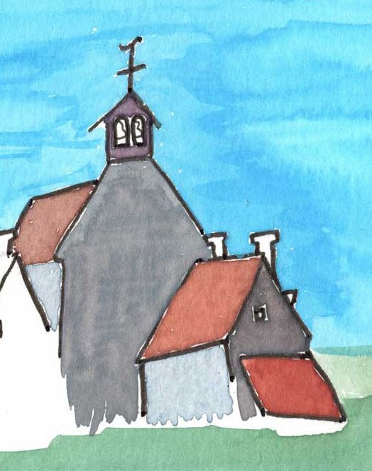
Saint-Amand, La Creuse

Don’t you love to receive a unique card in the mail - maybe a unique design with a personal touch?

Saint-Amand holiday card front & back

L'église Saint-Amand front & back

Today I share my 2021 holiday card available for purchase.

My pen and pencil drawing

Saint-Amand is a village over the hill not far from my house. It is a short bike ride away, and offers the nearest café to where I live.

First watercolors are applied

The church in Saint-Amand is nestled within the community, on a small square and near the Chez La Marcelle café and along a walking path.

Mixing the colors and choosing just the right ones

I hope you like this design! I so enjoy sharing my French communities with you.

Details:⁠

-Minimum order: one pack of 10

      1 pack of 10: $35

       Extra packs: $30 each

-original watercolor painting printed on smooth cardstock

-card size: 4.13" x 5.83" ⁠delivered with a white envelope

-custom printed in groups of ten⁠

-blank interior allows for your personalized message⁠

-the back of the card says simply "Saint-Amand, La Creuse" 

     with the artist’s signature or website 

-printed in the USA (for orders outside of the US, the cards are printed in the UK)

-allow two to three weeks from order date for delivery

Water color set with mixed colors on lid

Water color set in action!

Detail of the cloche-mur (bell tower)

The final painting

Greeting card with church and village

The final card - ready for you!

St Amand has a very narrow roadway passing through it - every time I drive between these two buildings I hold my breath!

Another view of the clocher-mur: an extended wall with openings for the church bells. The yellow sign below is the map for the hiking paths,

Clocher-mur-detail


Ever since I was in art school, I've been making my own holiday cards. In the beginning, they were all made by hand: printed or drawn; possibly painted or silkscreened.

A few years ago, thinking of all the people I wanted to send cards to who were not receiving one of the few hand created ones, I began printing them with my favoirte Moo card printer (who prints my business cards, too - they’re stunning!).

Saint Amand is a village over a hill, near my house. I can get to it one of four ways (excluding car travel). I can ride my bike to Croix de la Fortune and downhill all the way to Saint Amand, past cows, fields, farms and stone houses. This is very thrilling, because I feel like I can go so fast! The countryside is beautiful and the traffic very light.

The other way I can go is through the village of St Maixant, past the castle, the city hall, the school and the community center (all that makes St Maixant sound way bigger than it is! It is petite, also). Then ride the bike up the hill and over the top, past the grazing cows where one has a beautiful view of the Plateau Millevaches way off in the distance. Green pastures, blue sky, and communities sprinkled from here to the horizon.

The church in Saint Amand is nestled within the community, on a small square and near the Chez La Marcelle restaurant which recently re-opened, reimagined by the two grand daughters of the original Marcelle who had the café in the bottom of her house there for many years. I’ve heard it was a welcoming afterschool hangout for he local children back in the 50’s. The café faces the street that goes through the village named, aptly, "Le Petit Café".

An interview regarding my Oconee Street Church painting...

Jenny Jones of the Textile Center, MN had this great idea to interview the artists that participated in their “Common Thread” exhibit. My interview is here, and you can see the other artwork and the interviews on facebook at https://www.facebook.com/TextileCenterMN . It’s very educational just to see all the different techniques that textile artists use!
 
Today’s artist in the 7-UP series: Rene Shoemaker.

1. What was the inspiration for your piece in A Common Thread? 

I received a request from the Oconee Street Methodist Church to submit ideas for a commission. As there were 4 colors needed for the liturgical season, I made unique designs in each of the 4 colors. 3 were abstract (a purple grid design, a red stripe and squares design, and a “white” using yellows and greys on a white cloth). This green portrait of their church was made for “ordinary time”. I fell in love with the facade, the steps, and the bell tower of this historic church.

2. Please give a brief narrative of the timeline and process of creating your piece.

After receiving the request, I researched modern liturgical designs and the history of the Methodist Church. I then moved forward with Prismacolor colored pencil sketches, and after showing the colored pencil sketches to my contact, I created fiber art samples using Procion dye and gutta on different types of silk so that the committee overseeing the commission would have options to choose from. 

3. What is your history with this fiber form?

I learned this particular surface design method when I returned to the classroom after having graduated from the University of Georgia fiber design department, and immediately fell in love with it. I have been practicing this fiber form since 1980.

4. Is this your first time exhibiting in A Common Thread?

No, this is my third exhibition participation with the Textile Center.

5. Which fiber/textile artist do you have the most respect/ admiration for and why?

Judy Bales, because she has consistently followed her vision, and she is a rising star.

6. Can you describe a work of fiber art that’s displayed in your house?

I spent the summer in Cortona, Italy in 1998, and returned home with a sketchbook full of inspiration. I created one design that has had many iterations and sizes and color choices. This image is of a deep pink round table cropped in the lower left corner of the square silk. There is one yellow chair pushed up to the table, and there are 3 glasses of wine on the table. The background is intense blue.

7. Who is your favorite superhero?

Henri Matisse, hands down. 

website: www.ReneShoemaker.com
blog: coffeecuppress.tumblr.com

Photo: Today's artist in the 7-UP series: Rene Shoemaker.    1. What was the inspiration for your piece in A Common Thread?           I received a request from this Methodist church to submit ideas for a commission. As there were 4 colors needed for the liturgical season, I made a unique designs in each of the 4 colors. 3 were abstract (a purple grid design, a red stripes with squares design, and a "white" using yellows and greys on a white cloth). This green portrait of their church was made for "ordinary time". I fell in love with the facade, the steps, and the bell tower of this historic church.    2. Please give a brief narrative of the timeline and process of creating your piece.          After receiving the request, I researched modern liturgical designs and the history of the Methodist Church. I then moved forward with Prismacolor colored pencil sketches, and after showing the colored pencil sketches to my contact, I then created fiber art samples using Procion dye and gutta on different types of silk so that the committee overseeing the commission would have options to choose from.     3. What is your history with this fiber form?          I learned this particular surface design method when I returned to the classroom after having graduated from the University of Georgia fiber design department, and immediately fell in love with it. I have been practicing this fiber form since 1980.    4. Is this your first time exhibiting in A Common Thread?         No, this is my third exhibition participation with the Textile Center.    5. Which fiber/textile artist do you have the most respect/ admiration for and why?         Judy Bales, because she has consistently followed her vision, and she is a rising star.    6. Can you describe a work of fiber art that's displayed in your house?         I spent the summer in Cortona, Italy in 1998, and returned home with a sketchbook full of inspiration. I created one design that has had many iterations and sizes and color choices. This image is of a deep pink round table cropped in the lower left corner of the square silk. There is one yellow chair pushed up to the table, and there are 3 glasses of wine on the table. The background is intense blue.    7. Who is your favorite superhero?          Henri Matisse, hands down.       website: www.ReneShoemaker.com  blog: coffeecuppress.tumblr.com
What an honor for me to be part of this exhibit. Don’t you love Jenny’s last question? 
             Tell me - who is your favorite superhero?