This week, I wanted to share a new project with you. Though I’ve been working on it for a while, it’s a little different from my normal style! It’s been so much fun to branch out, though facing a new set of challenges can be daunting, too. Of course, that makes success feel all the better!
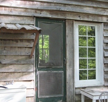
I had already been thinking a little about experimenting with screenprinting when my friend Lisa Fiscus approached me about developing a product for children. Lisa has created an amazing space in the Hawthorne House - it is equal parts fine decor boutique, interior design headquarters, and inspiration central! In addition to running her interior design services out of the building, she also offers a great selection of antique furniture, contemporary furnishings, and local art in the renovated showrooms. As the house was originally designed by Athens architect Fred Orr, we met when I was hard at work on the Orr2 exhibit that was held in the Circle Gallery in April 2009. For many of his buildings still standing in the Athens area, I created a silk piece highlighting a particularly interesting aspect of the design. In the case of the Hawthorne House, it was so amazing that I sketched the entire thing for my silk piece! Here it is: 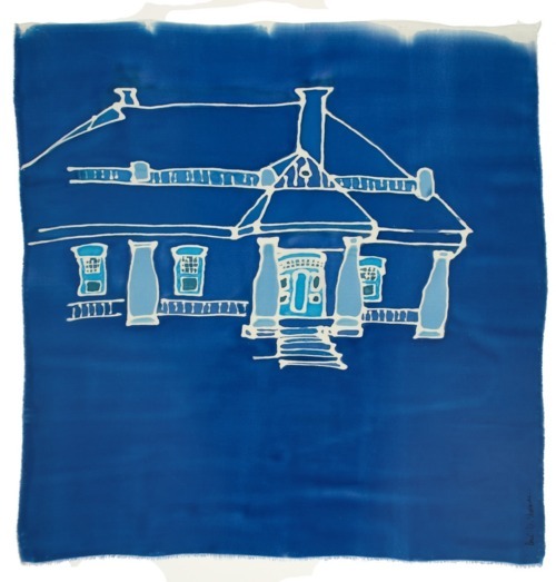
Lisa recently decided to expand her offerings to include decor for children’s rooms. Though the shop carried some of my silk pieces, she asked if I might be interested in designing an animal alphabet. Her idea was to display a prototype in one of the vignettes that she would be setting up around the store in preparation for the big annual party.
Since we wanted to develop a set of letters that could be used in any combination and in many different formats - on a pillow, as a wall hanging, even on pajamas! - we decided to choose a few to display on individual squares of fabric. After much discussion, we eventually chose a cotton muslin in a light cream color.
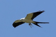
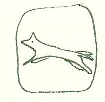
As for the pictures - well! The alphabet is so long, and there are so many animals to choose from! Studying dictionaries, encyclopedias, children’s books, talking to friends and family – I tried everything I could think of to come up with designs of animals that were unusual, recognizable, and aesthetically pleasing. Some letters were especially tough, like X and V and N, but my favorites were the elephant:

and the fox:
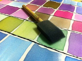
Finalizing my decisions and making the sketches was a lot of fun, but when it came time to print, I had a lot to learn! Though I silkscreened a couple of times in college classes, the details had to be worked out on my own this time. What kind of inks work best? What consistency is most effective? What’s the best way to blend colors? As each order would be unique, I wanted to offer customized colors, but I also wanted to be able to reliably reproduce colors. Watching someone create a silkscreened print, it looks so easy - but I worried about every step of the process!

It’s important to do a series of prints when silk-screening, as you never quite know which ‘pull’ is going to be the best. You don’t just make one, as I do with my silk paintings – and you have the opportunity to print on different cloths in the same series to see how the ink and design and fabric all work together. One thing I continue to be amazed at is that when silkscreening on a heavily textured cloth, the ink does not move down into the ridges and valleys of the cloth the way my silk dyes do – so the image left on the cloth is textured too, rather than being crisp and saturated. Smoother fabrics seem to take the print better – but I would love to figure out a way to achieve a crisp print on textured fabric!
For the prototype that is still on display at the Hawthorne House, I decided to spell out the name of Lisa’s son. After much trial and error, and lots of repositioning, I completed the sample and hung it on the wall over a beautiful antique bed next to a giant lamp made from Hable Construction fabric. The vignette looks great! I’m so excited about this new direction that my work is taking, and I am pleased to have finally mastered this versatile skill. Though I’m still stuck on X and V and N, if you have any suggestions, let me know!!